Chapter 7 Tools and methods
In this Chapter we describe various types of methods you may want to use in applied genomic epidemiological analysis, as well as different software tools for performing those analyses. Since this handbook is narrowly focused on applied genomic epidemiological analysis, this chapter focuses on easily-deployable and fast tools for performing comparative analysis of multiple genome sequences. We do not discuss bioinformatic approaches for generating consensus genomes from sequencing read data, nor will we elaborate deeply on methods and tools used primarily in academic settings for genomic epidemiological analysis. This chapter is most pertinent for readers who will be performing genomic epidemiological analysis themselves.
7.1 Phylogenetic placements
Phylogenetic placements are named as such since they place your samples of interest onto a previously-inferred, fixed phylogenetic tree. To do this, placement methods summarize the sequences of interest according to the nucleotide changes they carry compared to a reference sequence representing the root of the tree. This tree contains information about which mutations occurred along different branches in the tree. The sequences of interest are then placed into the “optimal” position on the tree according to the mutations that the samples of interest have and how those mutations are summarized by the tree. The optimal placement may be calculated differently when using different placement methods. While there are multiple methods for assessing the quality of the placement, the tools that genomic epidemiologists currently use most frequently determine the optimal placement by means of parsimony.
The most parsimonious placement of a sequence onto the tree is the one that requires the least number of additional mutations in the sequence beyond the genetic changes summarized in the tree. Notably, there may be multiple placements of a sequence onto a tree that require the same number of additional changes, and thus have the same parsimony score. Under this framework, these placements represent equally likely placements on the tree. The number of equally likely placements thereby provides a measure of uncertainty in the placement. If there are many equally probable placements then we are uncertain which placement is the “true” placement. If the number of equally probable placements is low, then we can be relatively confident in the placement position.
There are currently two commonly-used tools for performing phylogenetic placements of SARS-CoV-2 genomes: Nextclade and UShER. While both tools perform a phylogenetic placement, the phylogenies that Nextclade and UShER place samples of interest upon are different. This means that the way the output looks will be different, and what you can learn from one program may be more challenging to learn from the other. We recommend trying out and getting comfortable with both programs, as sometimes the UShER output is most informative, while other times the cohesive picture provided by Nextclade may be more helpful.
7.1.1 UShER
UShER will take your sequences of interest and place them on a megatree built from all SARS-CoV-2 sequences available from various public repositories (e.g. GISAID, NCBI GenBank, COG-UK data etc). In this way, UShER enables you to compare the genetic similarity of your samples to all other sequences available in the public repository of your selection.
UShER finds the n (where you set n) most closely related samples to your own samples of interest, and places your sample onto a small “subtree” showing the relationship between your samples and the other genetically similar sequences. This capacity is particularly useful when you want to know what sequences your samples of interest are most closely related to. When your samples of interest are highly genetically similar they will frequently end up on the same subtree. However, if your samples are not genetically similar, UShER will provide multiple subtrees for each of the samples, showing your sample of interest’s placement among other publicly-available genome sequences that were genetically similar to your sample of interest.
When you run UShER, the program will return a table of metrics that summarize the placement (see Figure 7.1 for an example). These metrics will provide some information about the genome sequence that you placed (e.g. how long it was, how many insertions or deletions the genome had, how many N’s the sequence had etc.). The table also provides information about the placement, including how many mutations (SNVs) the sequence had that UShER used to place the sample, which sample is the most closely related to the sample of interest, the number of maximally parsimonious placements UShER found, and the parsimony score. Of these, the number of maximally parsimonious placements and the parsimony score are some of the best metrics for understanding your placement. As discussed in the introduction to phylogenetic placements, the number of maximally parsimonious placements provides a rough measure of certainty. If there are many parsimonious placements, then you can’t take any one of the subtrees as the “true placement”. The parsimony score will tell you how many additional mutations were in your sequence beyond the mutations observed in other sequences and summarized by the tree. The larger the parsimony score, the more diverged your sequence is from other sequences found in public repositories. When looking at the subtree, you’ll see that this parsimony score will be equal to the branch length observed between the tree and the sequence of interest. For example, in Figure 7.2 the red branch leading to hypothetical_uploaded_sequence_1 is 3 nucleotides long, and that matches the parsimony score of 3 that you can see in Figure 7.1.
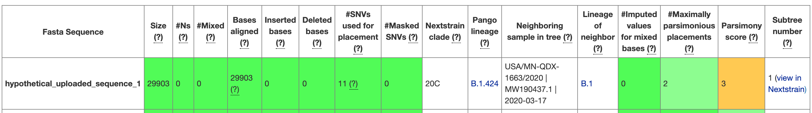
Figure 7.1: A screenshot from UShER showing the first entry in the UShER summary table for the hypothetical uploaded sequences that UShER provides. When you are on the website, you can hover over each of the column headers to learn more about them. You can see that metrics are given, and the cells are coloured according to a quality assessment.
Note that while the table view in UShER will provide the name of a sequence entry that was most closely related to your sample of interest, there could be multiple sequences that have identical genome sequences to whichever sequence shows up in the table as the “Neighboring sample in the tree.” You can see an example of this in Figure 7.2. In the table view (Figure 7.1), you can see that the Neighboring sample in tree for hypothetical_uploaded_sequence_1 is USA/MN-QDX-1663/2020 | MW190437.1 | 2020-03-17. However, when you look at the tree in Figure 7.2, you see that USA/MN-QDX-1663/2020 is one sample among many that have identical genome sequences, and thus stack vertically in the tree. This means that USA/MN-QDX-1663/2020 is as close of a neighbor to hypothetical_uploaded_sequence_1 as any other of the sequences in the subtree that have identical genome sequences as USA/MN-QDX-1663/2020.
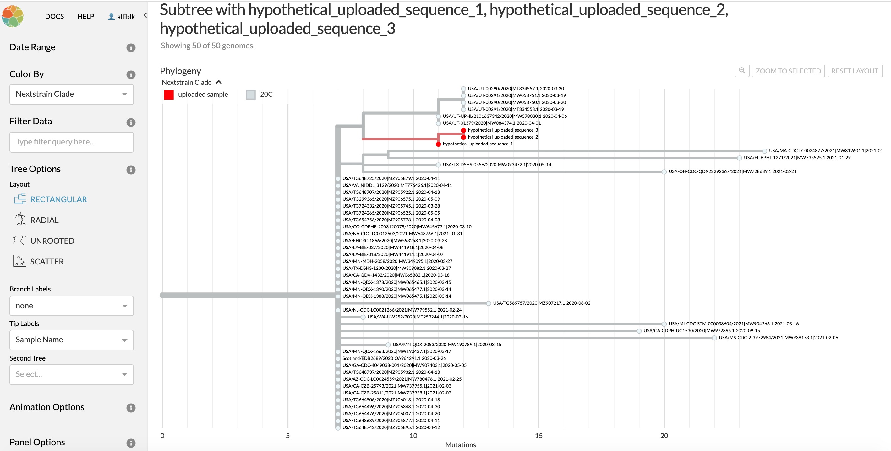
Figure 7.2: The subtree for hypothetical_uploaded_sample_1 that is linked in the last column of the UShER summary table. You can see that two more of the uploaded hypothetical samples are most closely related to hypothetical_uploaded_sample_1, and so these show up on the subtree as well. You can also see that there are many different samples that have the identical genome sequence to USA/MN-QDX-1663/2020. All of the samples with identical genome sequences to USA/MN-QDX-1663/2020 are as similarly related to hypothetical_uploaded_sample_1 as USA/MN-QDX-1663/2020 is, so in this case you should exercise caution in your interpretation.
7.1.2 Nextclade
Nextclade will take in your sequences and perform some quality assessment on the consensus genomes. You can then also place the sequences onto a background Nextstrain tree, either a globally-diverse phylogeny that is available by default within Nextclade, or some other previously-inferred Nextstrain tree that you supply. The Nextclade phylogenetic placement has the benefit of showing a fuller picture of viral evolutionary history leading up to where Nextclade places your sample of interest. Additionally, the Nextclade placement will place all of your samples of interest onto the same background tree, allowing you to see their placements together. However, Nextclade does not include any contextual data beyond the background tree, thus sequences near to your sample of interest in the placement may not be the most genetically similar sequences to your sample of interest. This is a key difference in interpretation between the Nextclade placement and the UShER placement.
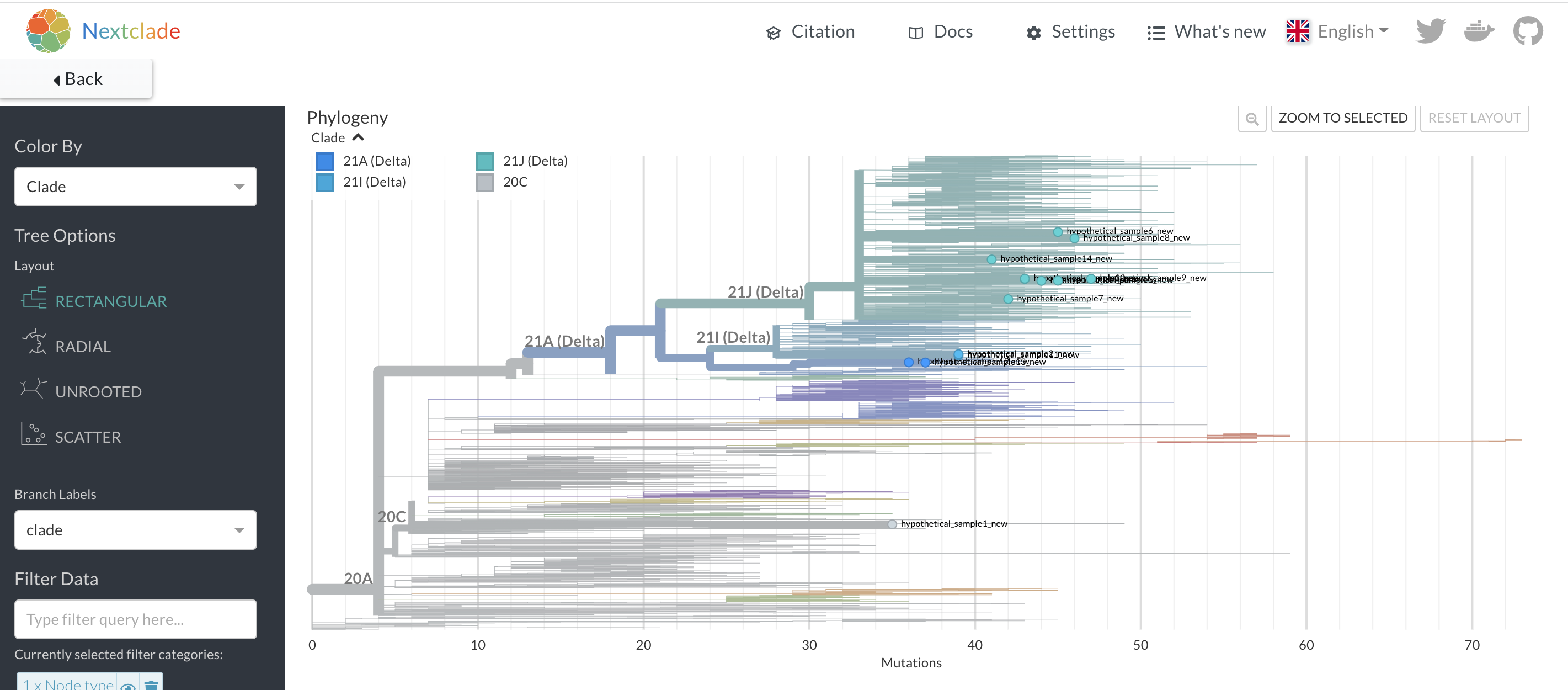
Figure 7.3: A Nextclade phylogenetic placement of 14 hypothetical samples. In contrast to the UShER subtree that we saw above, you can see the placement of all of these samples onto a single background tree, even though some of these samples are highly divergent. This provides a nice overview of the diversity of your sequences. However, this placement won’t tell you which sequences are most closely related to your uploaded sequences.
7.2 Phylogenetic trees
There are two commonly used methods of tree inference: distance-matrix methods and maximum likelihood methods. Distance-matrix methods take pairwise distances between all aligned sequences and aim to reconstruct a graph that represents similarities between samples. The distance matrix methods that you’ll see most commonly implemented in phylogenetic inference software are “neighbor-joining” and sometimes “UPGMA” (unweighted pair group method with arithmetic mean). While neighbour-joining performs better than UPGRAM, we avise generally avoiding distance matrix methods altogether because the trees recovered by these algorithms are representations of the similarity between the samples, rather than an explicit model of how the sequences have evolved. Distance matrix methods, however, are very fast for very large trees (with hundreds of samples thousands of nucleotides long), which is why you might see them used in some cases.
In contrast, maximum likelihood (ML) and Bayesian phylogenetic inference methods are more rigorous methods for inferring phylogenetic trees because they explicitly model the evolution of sequences. Thus, ML and Bayesian trees reflect the plausible relationships between sequences much better. Both ML and Bayesian methods take a long time to run on larger datasets because, unlike distance matrix methods which algorithmically cluster sequences by similarity and always give the same tree, ML and Bayesian methods search the space of all possible trees for either the single best tree or the set of most probable trees, respectively. That said, due to their popularity, ML methods have been iteratively improved with various approximations that make them run faster (RAxML and FastTree are examples).
Below, we outline some of the most common tools we see used in practice for inferring ML and Bayesian phylogenetic trees for applied genomic epidemiology. Notably, there are numerous tools for inferring phylogenetic trees, and this section will not present an exhaustive list of every tool you could use. Rather, we focus our attention on the tools that genomic epidemiologists use most frequently for public health investigations or genomic epidemiology studies.
7.2.1 Nextstrain
Nextstrain is really three things:
An analysis pipeline for building annotated ML phylogenetic trees,
A codebase for interactive tree visualization within the browser, and
A set of pre-built interactive trees for various pathogens, maintained by the Nextstrain team. These different components, and their different names, can sometimes be a point of confusion for new users, so we’ll unpack them here.
7.2.1.1 Nextstrain Augur
Nextstrain Augur is the analysis pipeline that takes in sequence data and performs steps such as aligning multiple sequences together, inferring a ML phylogenetic tree, inferring a molecular clock, and translating the genetic divergence ML tree into a time tree. The last step in a Nextstrain Augur pipeline is to package up all those results into a file that the user can visualize. That output file is called a JSON file, or a “JavaScript Object Notation” file. The Nextstrain JSON file will be formatted such that the file can be visualized with the second thing that Nextstrain is, a package for visualizing trees.
7.2.1.2 Nextstrain Auspice
Nextstrain Auspice is a JavaScript-based visualization package. It takes in the JSON file that you generated from running Nextstrain Augur. You can think of the JSON file as holding all of the tree information that you would like to see, and Nextstrain Auspice as the instructions for how to take that file and make it an interactive visualization that you can explore from a web browser window. Notably, Nextstrain Auspice will visualize any tree that is formatted according to the Nextstrain JSON structure, even if you did not build the tree with Nextstrain Augur. As an example of that, you can see that when you perform a phylogenetic placement with UShER, when you open up a subtree it’ll be visualized with Nextstrain Auspice. While UShER’s analysis pipeline performs the phylogenetic placement, they package the subtree up in the Nextstrain JSON format, which it allows it to be opened up and visualized by Nextstrain Auspice. If you have Nextstrain-formatted JSON files that you would like to visualize with Nextstrain Auspice, you can go to auspice.us and drop your JSON file onto the browser window. This will start Auspice running on the input tree in that browser window.
7.2.1.3 nextstrain.org
Finally, nextstrain.org is a website where visitors can access interactive Nextstrain trees for various different pathogens and outbreaks, such as trees summarizing the Zika virus epidemic in the Americas, the West African Ebola outbreak, or seasonal influenza circulation (among many others).
7.2.2 IQ-TREE
To create the genetic divergence tree in a Nextstrain Augur analysis, the pipeline uses an external software package that infers phylogenetic trees using a Maximum Likelihood-based procedure. If you have set up your own Nextstrain Augur pipeline, then you can choose which package you would like Nextstrain Augur to use. Currently, there are three you can choose from: IQ-TREE, RAxML, and FASTTREE. By default, Nextstrain uses IQ-TREE. If you want to generate a Maximum Likelihood genetic divergence tree outside of Nextstain, you can use IQ-TREE on its own, either using the command-line interface, or by specifying an analysis on the IQ-TREE web server, which has a graphic user interface for specifying options.
7.2.3 RAxML
RAxML is another commonly used package for Maximum Likelihood-based inference of genetic divergence phylogenetic trees. While it is highly accurate, it can take a long time to run on large datasets. While users frequently run RAxML from a command-line interface, there is a graphical user interface version of RAxML that you can download and use.
7.2.4 BEAST
BEAST, which stands for Bayesian Evolutionary Analysis Sampling Trees, is a powerful tool for phylogenetic inference and genomic epidemiology. Rather than performing a Maximum Likelihood analysis and generating a single most-likely tree, BEAST uses a Bayesian procedure that generates a posterior distribution of phylogenetic trees, which can either be summarized by a single tree, or analyzed as a whole. The benefit with having a distribution of trees is that you can more effectively capture phylogenetic uncertainty than you can with a single tree. However, performing this Bayesian sampling procedure can take long periods of time (days to weeks to even months for especially large and complex analyses), especially if you lack access to a scientific computing cluster upon which to run the analysis. Therefore, BEAST is more commonly used for academic genomic epidemiological studies, and may be less useful in public health investigations which prioritize fast turnaround times.
BEAST is notable for the evolutionary models that it allows you to run, which enables you to infer how the pathogen population size is changing over time from the phylogenetic tree. This area of genomic epidemiology is often referred to as “phylodynamics” since you are analyzing the dynamics of the pathogen population from the phylogeny. Phylodynamic analysis can be incredibly useful for understanding epidemiology, giving you another datastream from which to infer exponential growth rates, which can be transformed to estimates of \[R_{0}\]. Alternatively, you may wish to explore how enactment of different policies impacted pathogen transmission, which may be apparent from estimates of how the pathogen population size changed through time. A deeper discussion of these models and analyses in BEAST is out of scope for this handbook, but there are plenty of online tutorials and documentation for new users looking to try BEAST out.
7.3 When should I use a phylogenetic tree versus a phylogenetic placement?
Phylogenetic placements are excellent tools in many respects that provide answers incredibly quickly. Phylogenetic trees take longer to infer, but also conduct additional analyses that are not available from a phylogenetic placement. Given these trade-offs, when should you use which type of analysis?
The answer is somewhat subjective, and will be influenced by each user’s particular affinity for different types of analyses and software packages, as well as the user’s comfort interpreting the different types of outputs. That said, we offer the following opinions (and we welcome discussion and debate!)
Phylogenetic placements are particularly useful for answering a targeted question about what other sequences your sequence of interest is most closely related to. We like phylogenetic placements for epidemiological questions in which you’d like to know, of all the data out there and available, what looks genetically-related to yours. Some questions that phylogenetic placements are effective for answering include:
What sequences are most closely related to mine?
Could my outbreak be linked to someone else’s?
This is the first time I’ve detected this lineage. Where might it have come from?
This person has a travel history. Did their infection result from exposure while traveling?
Phylogenetic trees are typically more useful when you want to explore the descriptive epidemiology of an outbreak: person, place, and time. For example, because you can translate a genetic divergence tree into a time tree, something that you cannot do currently with a phylogenetic placement, temporally-resolved phylogenetic trees are preferable for looking at any sort of temporal dynamics within an outbreak, such as:
When did my outbreak start?
How long has my outbreak been ongoing?
How long has this particular lineage been circulating?
The ability to also incorporate geographic data into phylogenetic trees via phylogeographic analyses also means that trees can elucidate important geographic dynamics, such as:
How is this pathogen moving between different areas?
Which different regions appear to be linked or show pathogen exchange?
How frequently is this pathogen moving between these different regions?
Questions about place and time can also be explored together with phylogenetic trees. For example:
How long did this pathogen circulate in my region before moving to a different region?
When did this pathogen first arrive to my region, and where did it come from?
Is my outbreak sustained by endemic transmission, or is our outbreak frequently being re-seeded from other areas?
Finally, phylogenetic trees are preferable when you have questions regarding transmission dynamics, such as:
Did our travel policies change how frequently we saw introductions of the pathogen to our region?
Did we manage to bring this outbreak to a halt?
Has this lineage continued to circulate cryptically within our community, or did we manage to extinguish local transmission completely?
7.4 Selecting contextual data for phylogenetic tree analyses
Selecting appropriate contextual data to include in a phylogenetic analysis can be a bit of an art, although as you do it more frequently you will begin to build up your intuition for when you lack sufficient contextual data. Often you will need to assess your contextual data selection iteratively, building your dataset, inferring your tree, looking for areas of the tree that you believe lack sufficient context, refining your dataset, and so on. There is absolutely a need for more systematic strategies for selecting which contextual data to include, and evaluating whether sufficient contextual data have been included in an analysis. But in the meantime, here are some suggestions to get you started.
Firstly, try to include external sequences that are nearly-complete and of high quality. This will usually improve the quality of multiple sequence alignment. When sequences with high numbers of N’s are included in the analysis, it becomes hard to align them effectively, and those sequences can get misaligned. The effects of that misalignment can compound, with the misalignment making samples look overly divergent, which can affect your estimate of the evolutionary rate, and even lead to strange topologies within the tree.
Secondly, you will often want to include a small number of contextual samples that capture the full extent of an epidemic. For instance, even if you are seeking to describe a SARS-CoV-2 outbreak in Moosejaw, Canada, you’ll typically want to include a small number of representatively-sampled sequences from every continent where SARS-CoV-2 transmission has occurred, over the entire duration of the pandemic. These sequences help build the “back-bone” of the tree, ensuring that your analysis accurately captures the historical evolutionary dynamics that lead up to your outbreak of interest. Furthermore, the inclusion of this type of contextual data can improve the precision and accuracy of your estimate of the molecular clock, since typically they will have been collected serially over a longer time period.
Finally, you will also typically want to include contextual data that are closely-related to your outbreak of interest. You will usually determine which samples fall into this bucket of contextual data by using either your general knowledge of community connectivity or by systematically selecting samples that are minimally genetically diverged from your samples of interest. As an example of the former, perhaps you know a priori that individuals in community A often travel to community B for work, and vice versa. In that case, it would seem reasonable that community A and community B have related outbreaks, and so you would be sure to include sequences from community B in your analysis of community A’s outbreak. As an example of the latter, within Nextstrain analyses of SARS-CoV-2, you can select a set of samples to be your “focal” set, and then ask Nextstrain to include contextual sequences that are genetically-similar to that focal set. Under this procedure, you begin with a large pool of samples from which you could draw your contextual sequences, and you select ones to include in your phylogenetic analysis based off of the number of mutations that differ between those potential contextual sequences and the sequences within your focal set.
7.5 Notes about node ages in temporally-resolved trees
Within a time tree, the internal nodes will have estimates of their ages, and some type of confidence range around that estimate. The type of confidence interval will vary depending on whether you have used a Bayesian or Maximum Likelihood method for inferring your time tree. Depending on what software you use, or how you’ve specified your analysis, these node ages may be given as: calendar dates (e.g. March 07, 2017), decimal dates (e.g. 2017.18), an amount of time beyond the age of the root (e.g. the root age is 0 years, and your sample is 1.8 years into the future from the root), or an amount of time into the past as calculated from the youngest tip in the tree (e.g. the most recent tip in your tree was collected on June 10, 2019, and the ancestor that you are interested in is 1.2 years back into the past from that youngest sample).